
Blog
The Quiet Architecture of a Well-Composed Entrance

A home rarely declares its standards with volume. More often, it does so with control. The door opens, the eye adjusts, and within seconds the space has already made its case. Some interiors feel immediate and settled, as though every object has been considered in relation to the next. Others feel visually expensive yet oddly unsettled. The difference is often not in the main living room or dining area, but in the threshold itself.
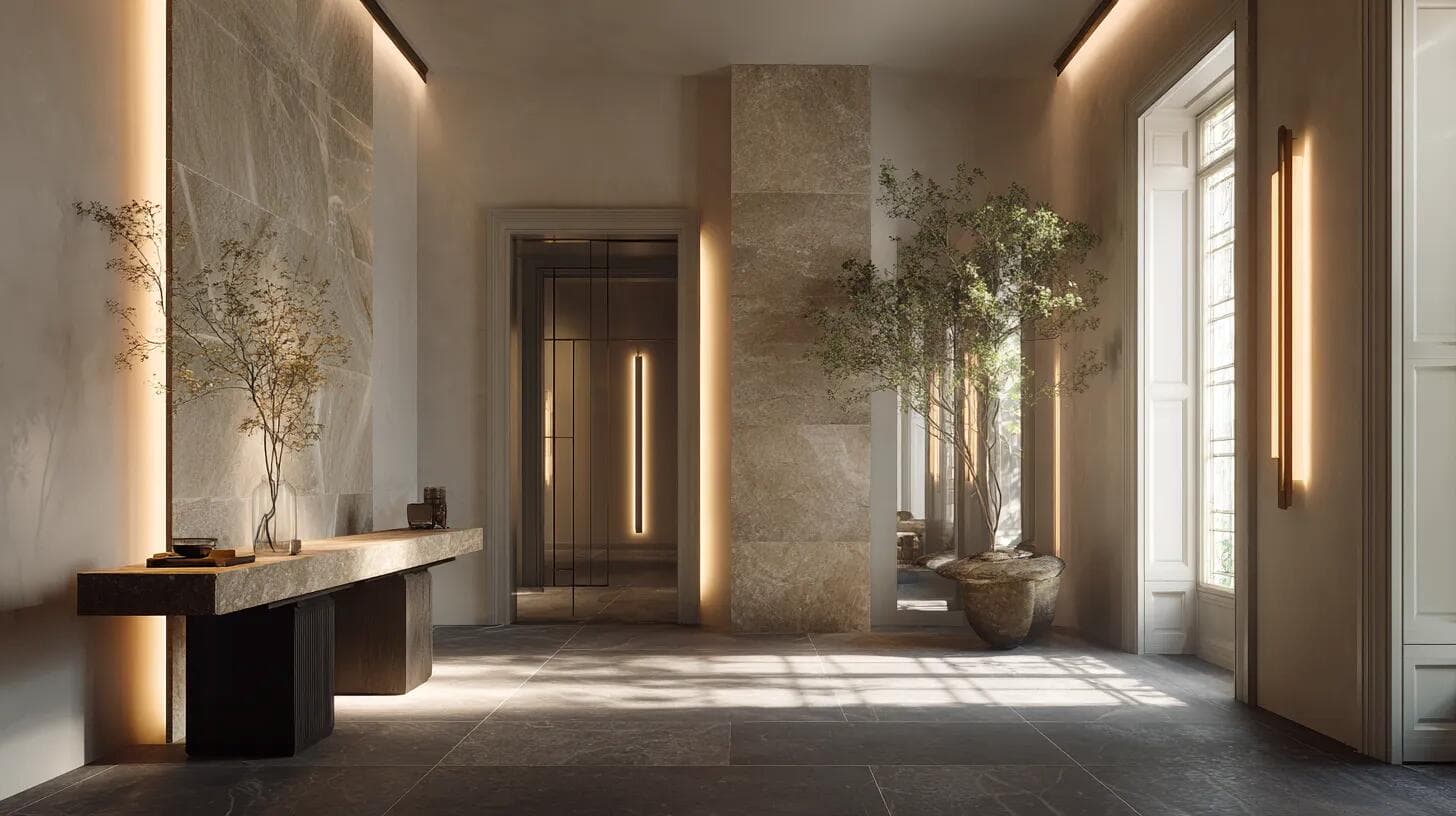
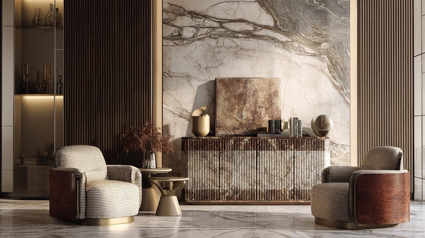
Arrival spaces ask a great deal of a home. They have to absorb movement, hold daily necessities, and establish atmosphere, all without looking overworked. That tension explains why entrances are so often mishandled. They are treated as leftover zones rather than as the sequence that introduces the home’s point of view. In many homes, the solution begins with disciplined perimeter furniture. Looking at entryway console tables category helps clarify why these pieces matter: they create a landing surface, hold the wall visually, and bring order to the moments of arrival and departure.
In my experience, the most persuasive entrances are not the most decorated. They are the most legible. You understand them at a glance. The sightline feels composed, the proportions make sense, and there is enough visual confidence for the rest of the home to unfold naturally. That aligns with the broader direction of contemporary interiors, where calm, adaptable, and sensory-aware spaces continue to shape the way refined homes are composed.
Why the threshold sets the tone
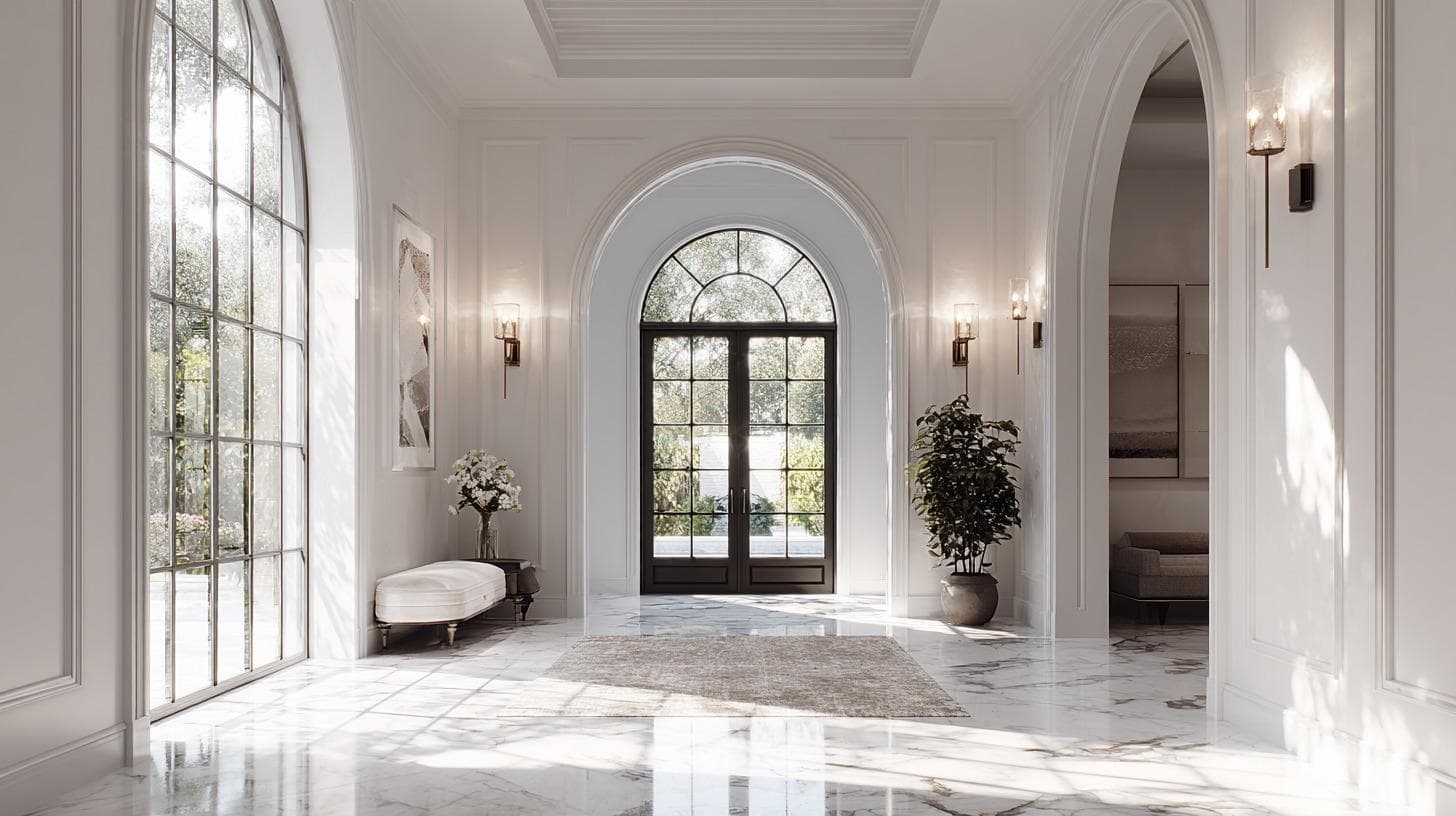
An entrance does not need grandeur to feel convincing. It needs clarity. When someone crosses the threshold, they are reading more than furniture or finish. They are registering light, balance, spacing, and the ease of movement. A strong entrance reduces friction for the body and gives the eye a place to settle.
That sense of ease matters. Visual clutter changes how a home is experienced, even before a guest has moved beyond the first few steps. A threshold that feels crowded, top-heavy, or unresolved can make the entire interior seem less calm than it really is. By contrast, a composed entrance creates trust. It suggests that the home has been shaped with intention rather than assembled room by room.
Personally, I believe that this is where many luxury interiors quietly distinguish themselves. They do not rely on excess to create an impression. They rely on proportion, restraint, and the confidence to leave some space unfilled.
The three pressures every entrance must solve
A well-composed entrance usually resolves three competing pressures at once.
The first is circulation. People need to enter, pause, turn, and continue through the home without a sense of compression. Any furnishing placed here must respect movement before it contributes style.
The second is utility. Entrances collect the evidence of daily life: keys, post, sunglasses, bags, parcels, and the objects that accompany arrival and departure. Ignore that fact and the space will begin to work against itself within days.
The third is presence. A threshold should not feel accidental. It needs a visual anchor, particularly on a long wall or in a transitional zone where the architecture alone may not provide enough structure.
When those three pressures are addressed together, the room feels coherent. When only one is solved, the compromise becomes obvious. A purely decorative entrance often looks beautiful for a moment and impractical after that. A purely functional one rarely escapes the feeling of apology.
What refined homes understand about perimeter furniture
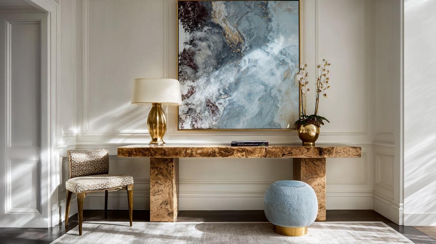
One of the most reliable ways to stabilise an entrance is to use a piece that behaves more like architecture than ornament. The strongest perimeter furnishings define a plane. They hold the wall, establish a horizontal line, and give the eye something to read before accessories are introduced.
This is why proportion matters more than novelty. A piece that is too slight disappears against the wall and leaves the room visually underfed. One that projects too far begins to interrupt movement. Height matters as well. Too low, and the furnishing feels disconnected from the artwork, mirror, or lighting above it. Too high, and it starts to work against the body moving through the space.
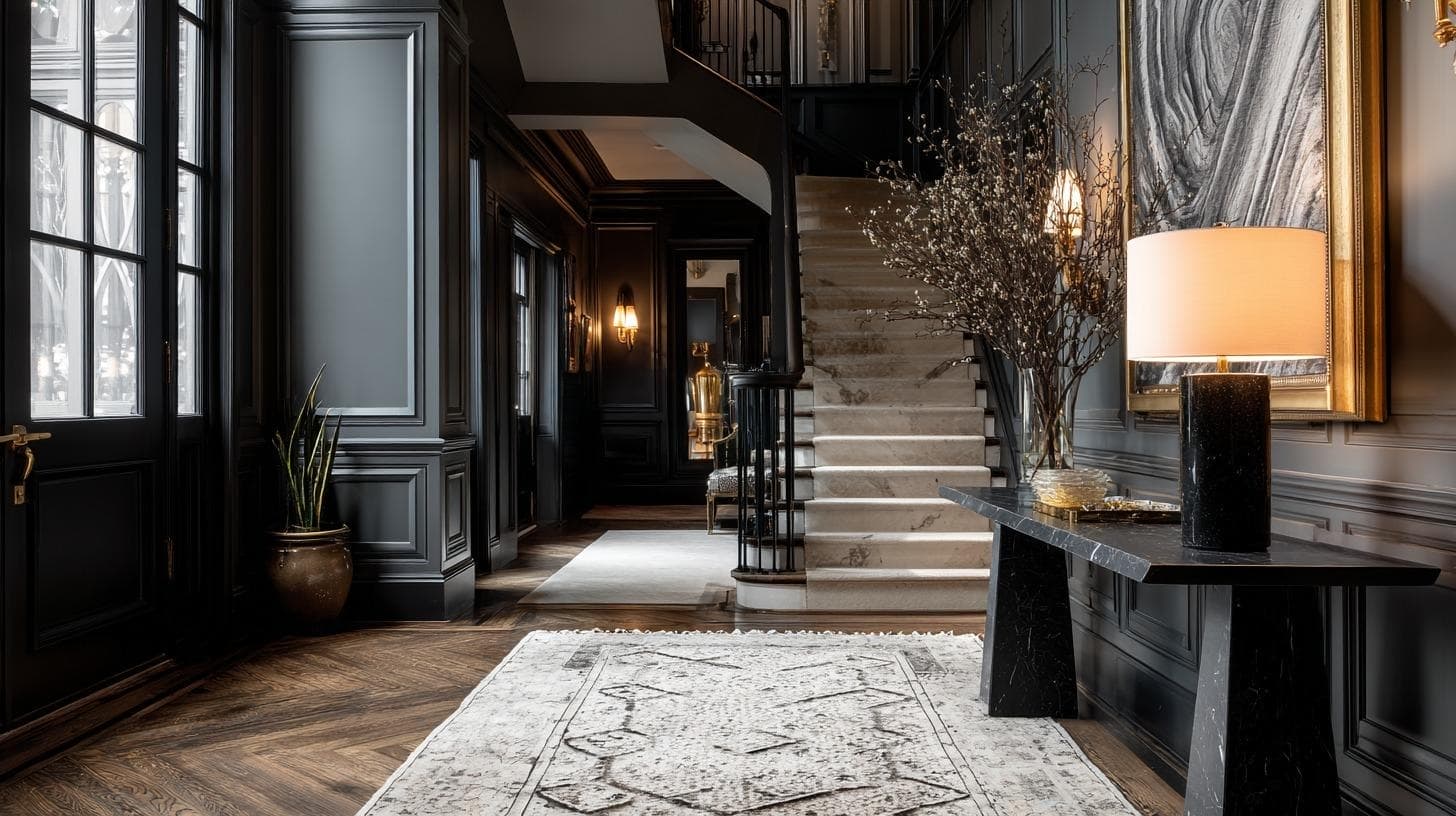
Material also changes the emotional reading of the threshold. Reflective finishes can sharpen a space and make it feel more formal. Woods with visible grain tend to introduce warmth and soften the arrival. Stone, lacquer, and metal each carry their own visual weight. The goal is not to choose the most expressive material in isolation, but the one that best supports the home’s underlying tone.
The mistakes that make an entrance feel expensive but unresolved
The most common error is confusing decoration with composition. A homeowner places a modest piece against a substantial wall, senses that something is missing, then compensates with a mirror, a lamp, florals, books, candles, and decorative objects. Instead of gaining presence, the arrangement becomes nervous.
Another mistake is treating the top surface as a stage set. A threshold should not look as though it has been styled for a photograph and forgotten. The objects that live there should acknowledge real use. A tray, a lamp, perhaps one sculptural gesture, perhaps a vessel with branches. Not much more. Once a surface begins performing too many roles, it loses authority.
Lighting is often mishandled in the same way. Entrances benefit from warmth and control, especially in the evening when shadows help architecture register. Overhead light that is too bright can flatten the scene and expose every object equally, which is rarely flattering. A more considered approach allows certain forms to emerge while others recede.
Then there is the matter of concealment. Storage does not need to dominate the threshold, but the absence of any storage logic nearly always announces itself. The polished entrance that has nowhere for keys, post, or a handbag is already on borrowed time.
The trade-offs in smaller and transitional homes
Smaller homes often produce the most elegant entrances because they demand discipline. With less room for excess, every decision has to justify itself. Still, trade-offs remain.
A slimmer profile protects circulation but can reduce practical use. Open shelving may lighten the visual weight of a piece, yet it also reveals whatever is stored there. A strong sculptural silhouette can give the wall authority, but if the finish is too assertive it may make a compact threshold feel busier than it is.
As I see it, restraint should never be mistaken for emptiness. A small entrance still needs one dominant gesture. It may be a low horizontal furnishing, an oversized mirror, a lamp that softens the corner, or a single artwork that steadies the axis. What it does not need is a collection of half-decisions competing for importance.
That is often where refined homes separate themselves from merely decorated ones. They choose one idea and let it hold.
A framework for a more composed arrival
For anyone reassessing the threshold, a simple sequence helps.
First, stand at the door and look for the visual anchor. If the eye does not know where to settle, the room likely needs a stronger horizontal line or a clearer focal point.
Next, walk through the path as you would on an ordinary day, carrying keys, a coat, a bag, or post. If the furniture interrupts the body or fails to support that ritual of arrival, it is not yet doing enough.
Then edit the upper surface until the composition feels intentional from several angles, not only straight on. Entrances are read in motion. They need to hold together while someone is passing through, not only while standing still.
Finally, assess tone. Does the threshold feel aligned with the rest of the home, or does it read like a separate idea? Continuity matters. A composed entrance should preview the home’s language, whether that language is warm minimalism, layered classicism, or something moodier and more sculptural.
Why calm reads as confidence
The best entrances do not try too hard to announce welcome. They do something more difficult. They make order feel effortless. They suggest that the home has been considered from the edges inward, not decorated in isolated moments.
That is why transitional spaces deserve more seriousness than they often receive. They are the first editorial sentence of the home. When shaped with proportion, utility, and restraint, the rest of the interior begins to read more clearly. Not because the entrance is louder, but because it is calm enough to establish trust.
I’m inclined to think that this is one of the clearest expressions of luxury in a private residence. It is not simply about what has been acquired. It is about how confidently the home knows where to begin.
Related Posts

Casa Valle NYC, BD Barcelona Reimagines Gaudí’s Iconic Batlló Chair
-
Posted by
Ms Luxury Brand